Utilizing Tappable Design Elements: A Guide
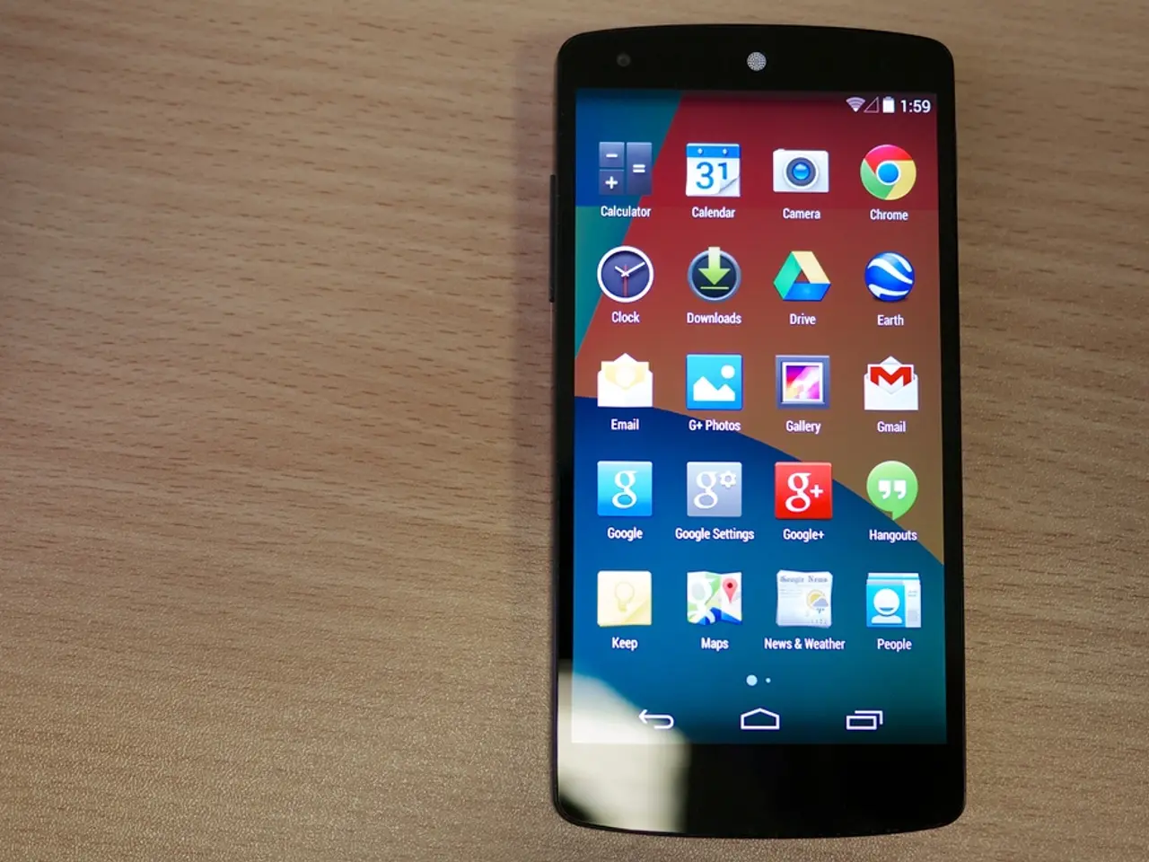
In the realm of mobile user experience (UX) design, creating interfaces that are accessible and easy to navigate is paramount. Two major players in the industry, Apple and Google, have provided guidelines to help designers achieve this goal, particularly in terms of touch target sizes.
According to Apple's Human Interface Guidelines, the minimum touch target size should be 44 x 44 pixels. This recommendation is designed to accommodate finger taps comfortably, ensuring users can interact with the UI without needing to experiment. On the other hand, Google's Material Design suggests a minimum touch target size of 48 x 48 density-independent pixels (dp), a unit that adjusts for screen density, ensuring consistent physical size across devices.
These minimum sizes are not just numbers; they play a significant role in improving usability, reducing mistakes, and enhancing overall user satisfaction in both Android and iOS environments. By adhering to these guidelines, designers can create interfaces that are intuitive and user-friendly across different screen sizes and input methods.
When designing for touch interfaces, it's not just about the size of the touch targets but also the space between them. Being mindful about the spacing helps prevent user errors from accidental taps. It's also crucial to ensure that visual targets for touch interfaces are big enough to attract the user's eye, be actionable, readable, and easily tappable.
Testing your design with real users is another essential step. Understanding how people interact with the device and the touch target's tappability can provide valuable insights for refining the design. Furthermore, setting your canvas to the logical resolution of the device and exporting assets such as icons and images in different resolutions according to the platform's requirements can help ensure a seamless user experience.
In summary, by understanding and implementing the minimum touch target sizes recommended by Apple and Google, designers can create interfaces that are not only visually appealing but also easy to use and navigate, enhancing the overall user experience on mobile devices.
The process of creating visually appealing and user-friendly mobile interfaces involves more than just graphic design; it incorporates user experience (UX) design, interaction design, and following guidelines from industry leaders like Apple and Google. For instance, Apple's Human Interface Guidelines recommend a minimum touch target size of 44 x 44 pixels, while Google's Material Design suggests a minimum of 48 x 48 density-independent pixels (dp). Adequate spacing between touch targets is equally important to prevent user errors from accidental taps, and visual targets should be big enough to be actionable, readable, and easily tappable. Finally, user testing and adhering to platform-specific requirements for resolution and asset export are crucial steps to ensure a seamless user experience in data-and-cloud-computing technology-driven mobile environments.


